


Hope you enjoy this month’s newsletter my friends.
- SAHIL
Meme of the month
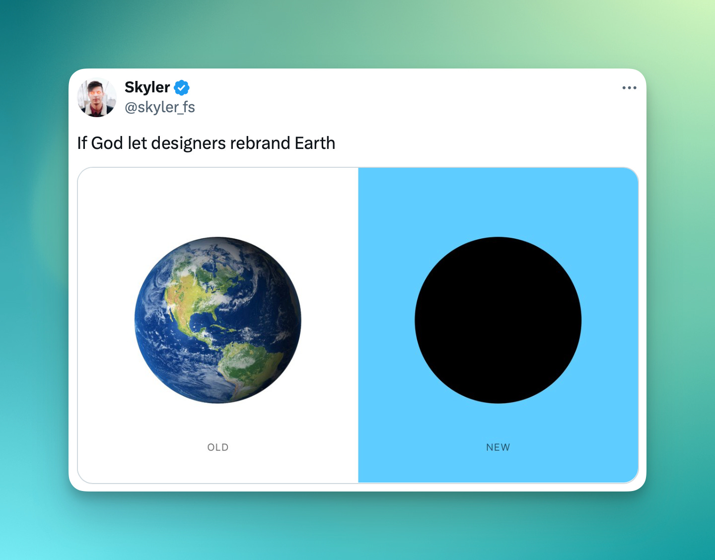
My man’s tweets are horribly under appreciated.
The Paradox of Builders & Users
In this post, Hardik talks about the contrast of time spent in-app between builders and their users. Builders are surrounded by their product almost 24/7, while users spend a tiny fraction of their time. It may be difficult to accept, but people just don’t care about you or your problems!
Builders are always trying to improve their product, but users often just want it to be reliable and work the way it always has. I think this applies to bitcoin products too. Terminally-online bitcoiners are always looking for the next big fix or upgrade, while users often just want a wallet that works reliably.
A Member at ABDC pointed out that an example of this paradox was when Apple shipped a redesign for Safari on mobile, moving the search bar from the top to the bottom. From the builder’s point of view, it was a better experience (easier to reach with your thumb!). But users hated it, because it was such a radical change.
I think the takeaway is just to know when to stop and “let the product breathe” as Hardik says.
BlueWallet on wallet complexity
The BW team posted in a thread a while ago, asking what features are missing in their wallet. Turns out, a lot of the features people wanted were there, but hidden under advanced settings.
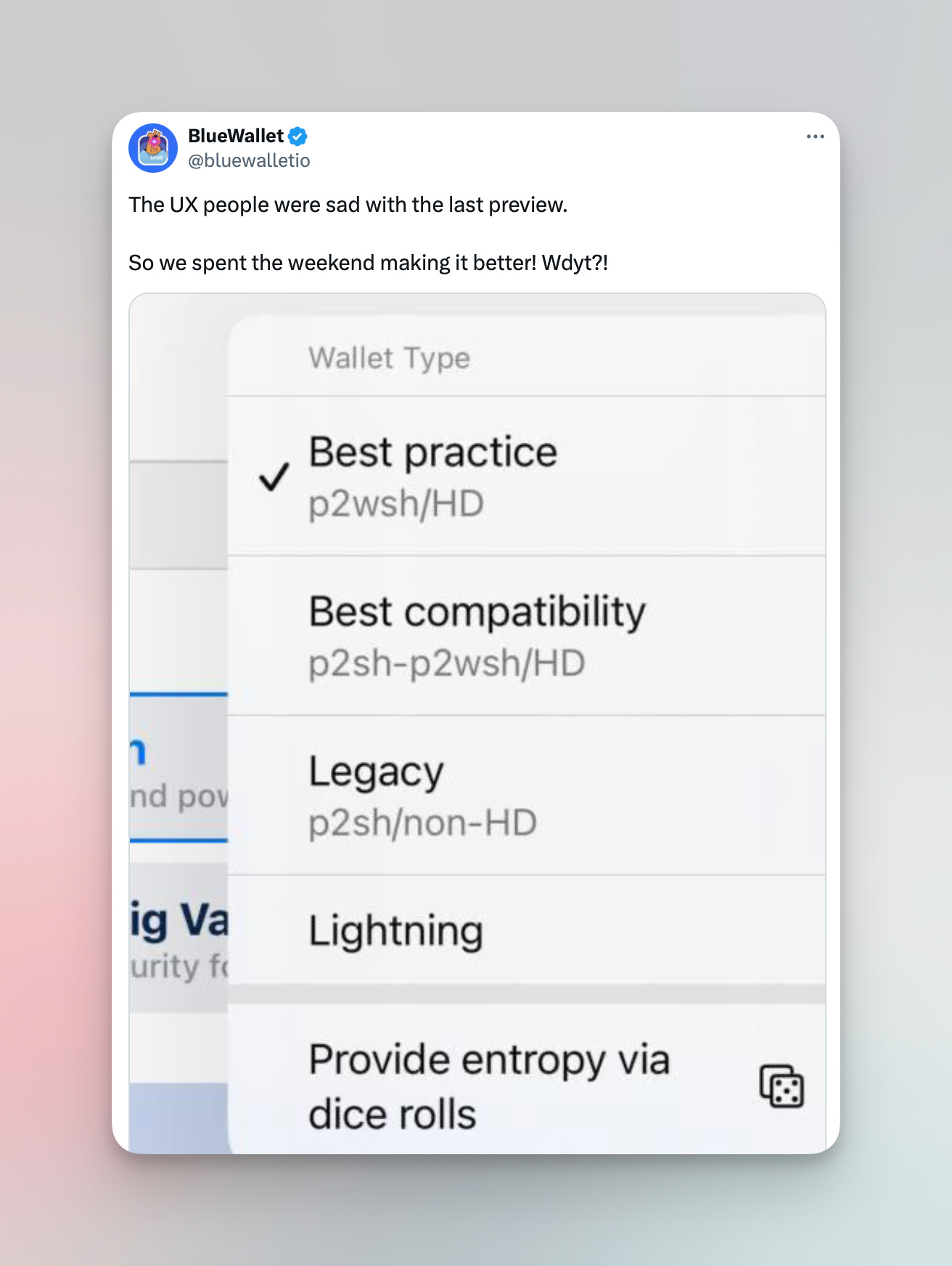
This led the team to believe that most users wanted access to those advanced settings, and so they pulled out the setting, exposing it to everyone. This seems reasonable, especially considering that it’s still relatively hidden underneath an advanced overflow menu.
My main thought here is the labels for the wallet types: it’s not totally clear to me which one I’d pick, between “Best practice” and “Best compatibility”. I want to follow best practices, but I also want the best compatibility!
What if instead, the same seed was able to generate a segwit address, but was also able to generate a wrapped segwit (“best compatibility” address) in-context at time of receiving? With an action like “Unable to receive?”. What do you think?
✨ Sponsored ✨ Interested in reaching an audience of builders in bitcoin? Reach out
Austin Bitcoin Design Club
ABDC is a monthly gathering of bitcoiners, designers, engineers, and more, from all walks of life. We are building a space for fostering connections, idea development, and most importantly creating a strong sense of a design community from which we may all draw support.
RSVP for the next meetup using the link here: https://www.meetup.com/austin-bitcoin-design-club/

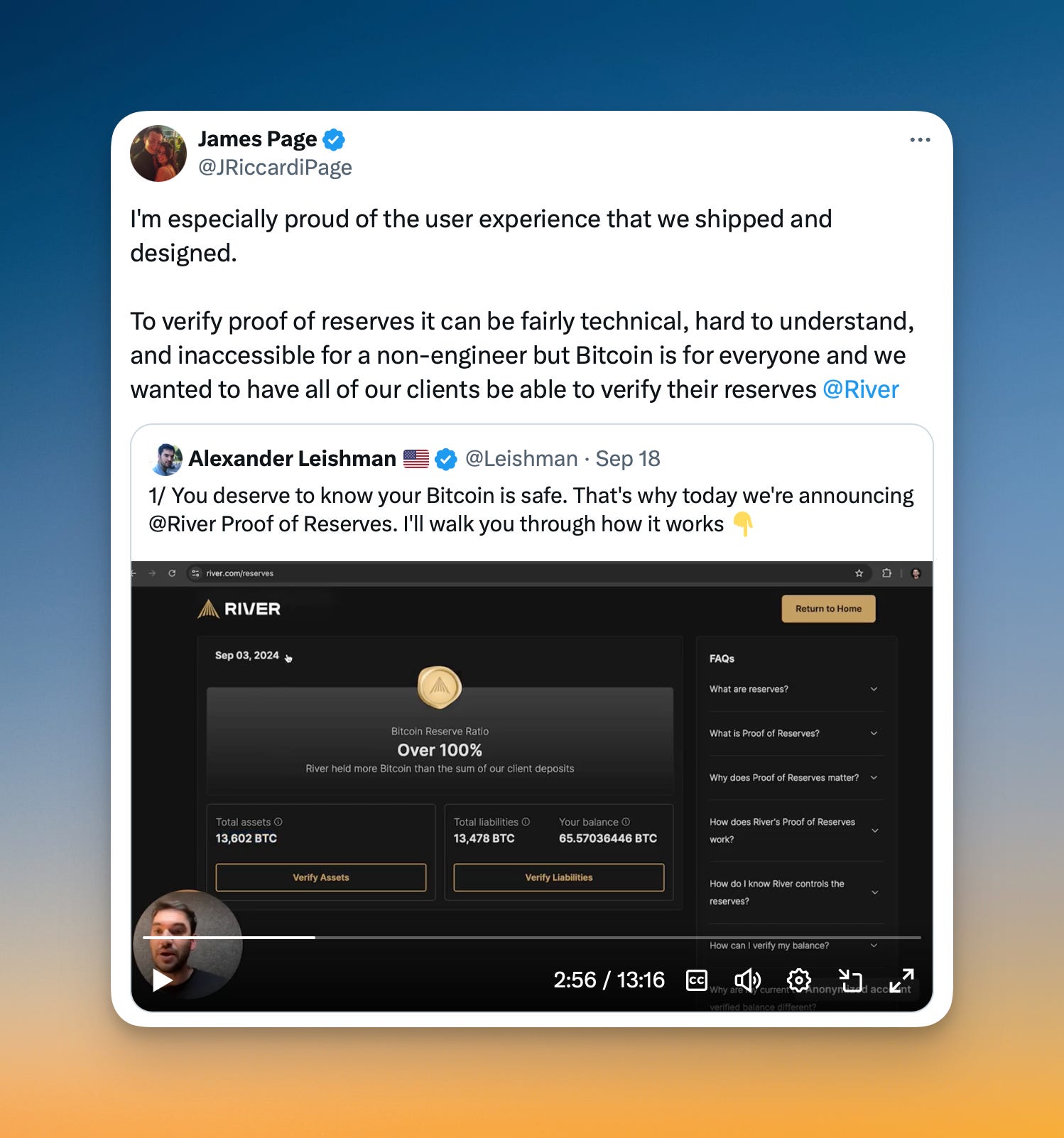
Security that’s visible and felt
This tweet really made me think. The idea of verifiable security can be challenging in bitcoin, since it’s hard to tangibly show that your system or their bitcoin are secure.
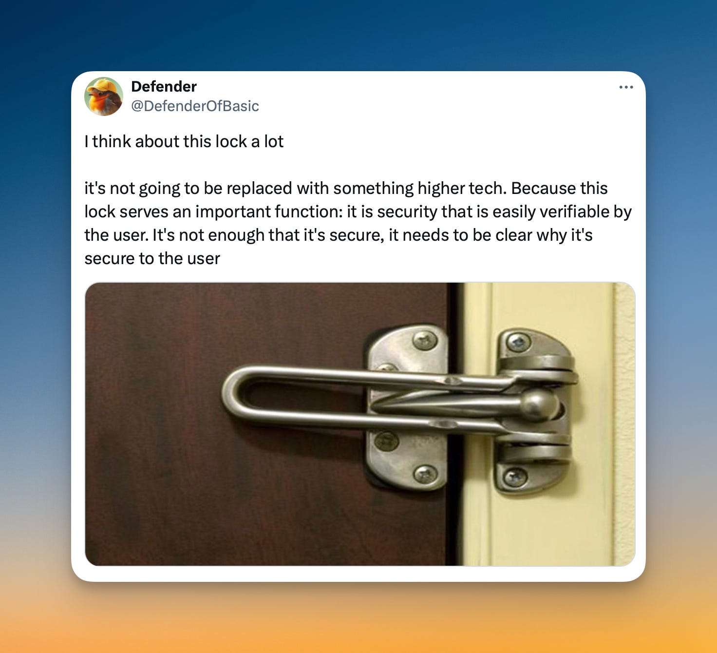
I think River has done a great job of this with their recent launch of Proof of Deposits and Proof of Liabilities. For one, you can follow simple instructions to verify the security of the product. Also, the “wax seal” of the River logo makes it feel strong, safe, and secure. It’s something I think about with multikey savings vaults, too. They need to feel secure!
To me, it’s not just verifiable security, but the feeling of security that’s extremely important in a user experience.
LiveWallet: Visualize the pain
This is a really interesting project. It’s not the most polished thing out there, but it’s a great proof of concept for how wallets can educate users about potentially costly transactions. There are a lot of technical constraints with bitcoin wallets, especially multikey ones, and expensive fees is one of them. This project helps visualize the cost of spending a “chunk” of bitcoin (UTXO) in different simulated fee environments.
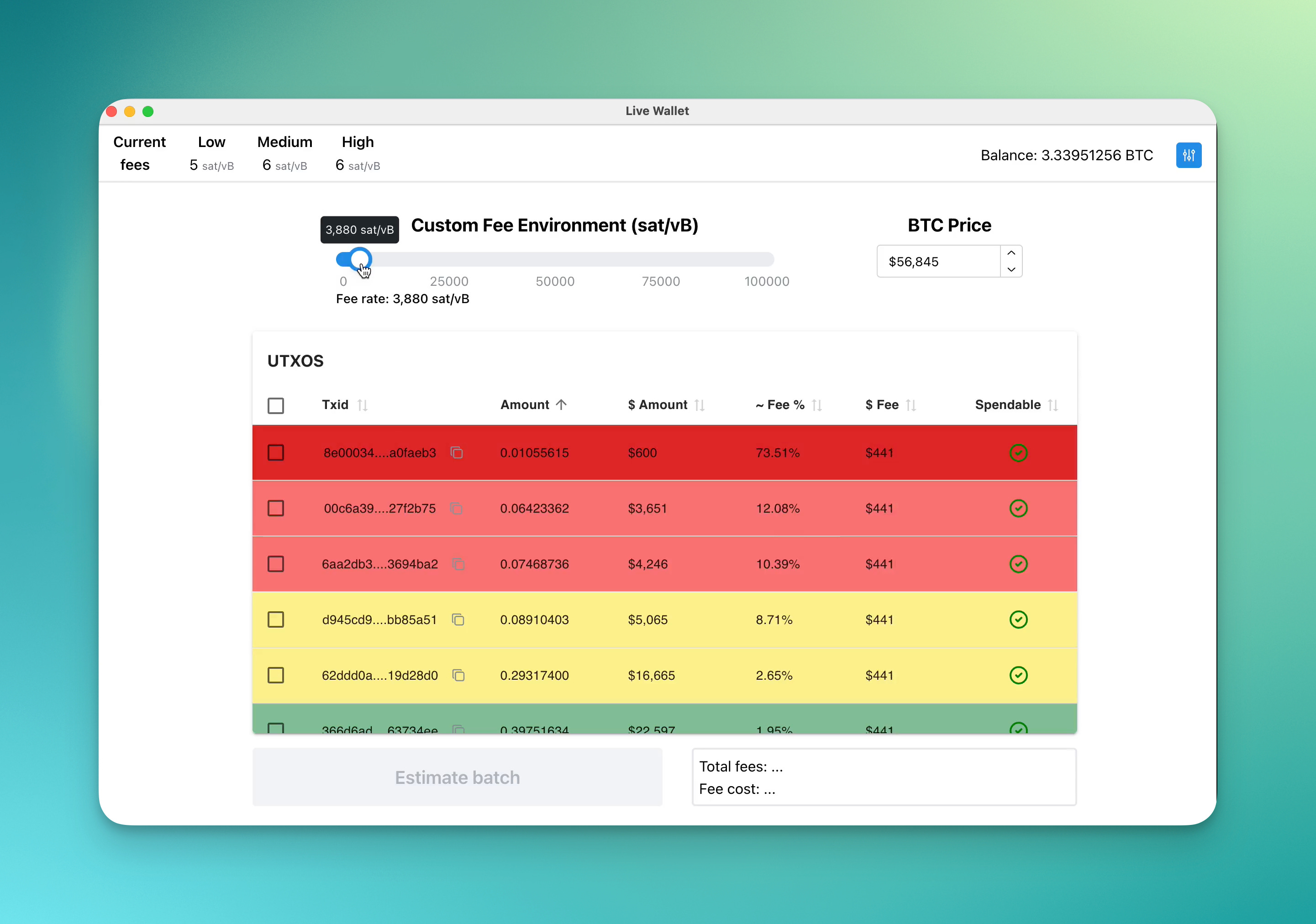
I could see a view like this being useful in addition to automated reminders to consolidated chunks of coin in low-fee environments.
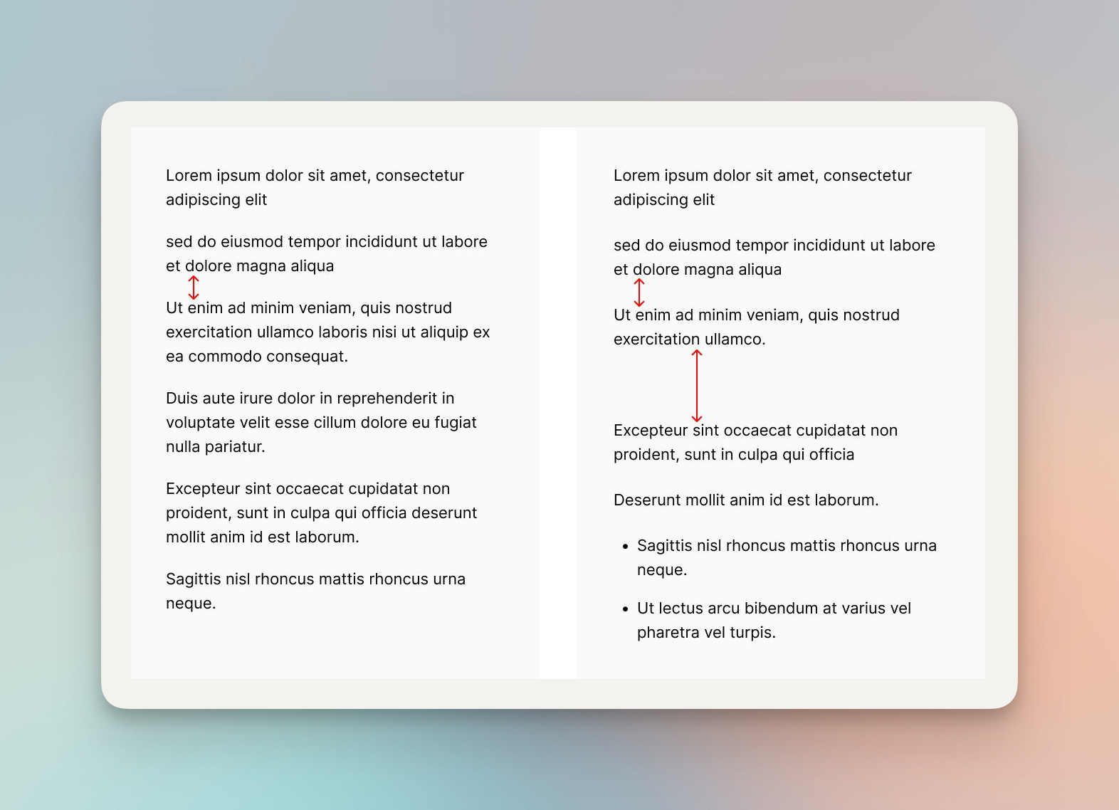
Law of Proximity
This is a useful Gestalt principle that points out that elements that are grouped together are perceived by the brain as having some similar functionality. It can help users take action and process information quicker.

For example, adding space between two paragraphs tells your brain that they are two separate collections of text that should be interpreted separately, rather than together.
Related, Zander makes a great video going through some quick visual hierarchy tips for your UI. A lot of his recommendations are related to this proximity principle, grouping related. UI elements.
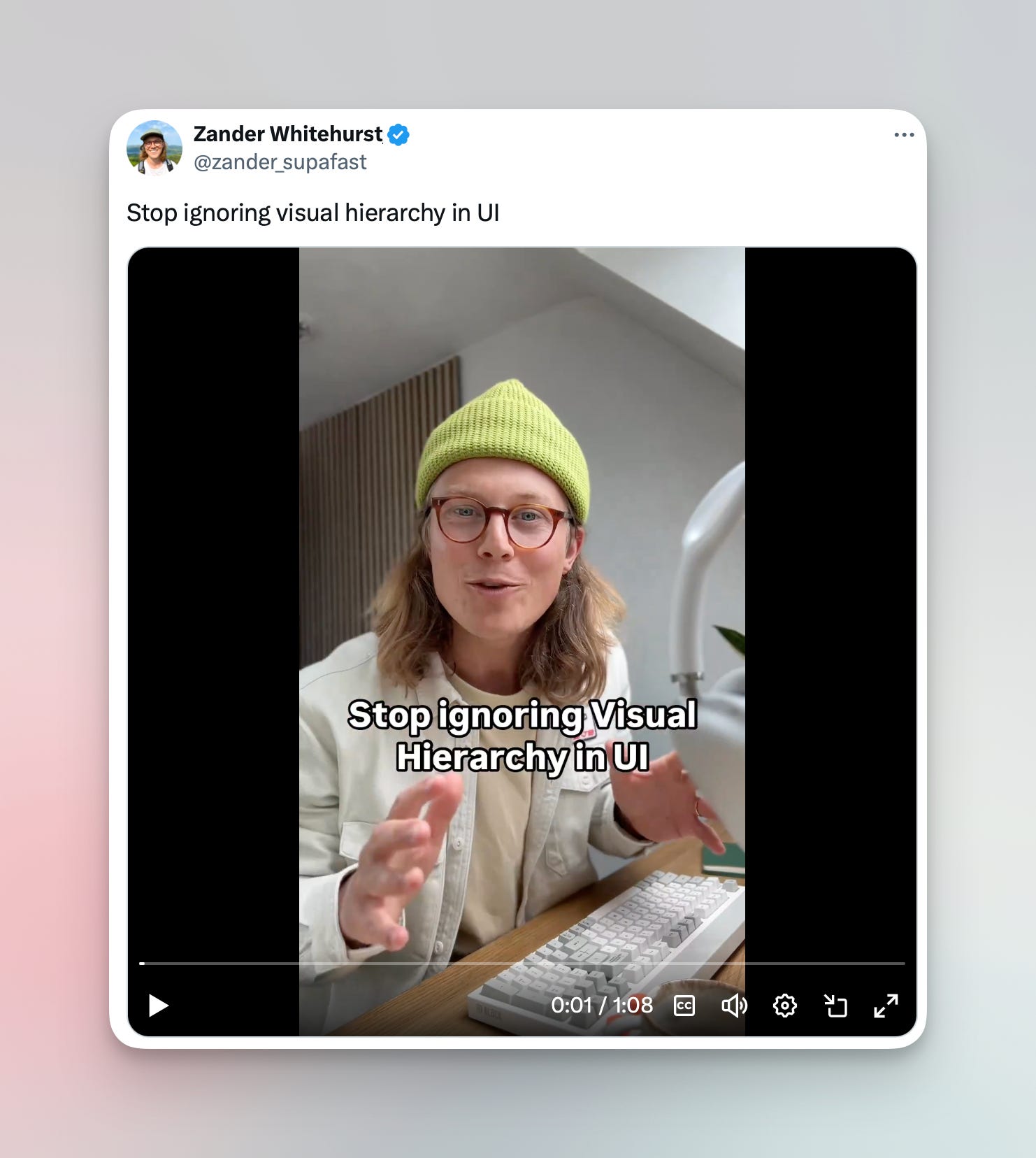
I remember working with Will Cole at Unchained, our process for building a screen or flow would involve something similar to what Zander did in his videos - listing out all the “bits” you need (save button, star icon, map, action button, etc). Then, grouping the bits based on proximity (either function or some visual characteristic), and finally organizing by some hierarchy.
Shameless self promo
I’m not above it guys. I recently joined the great team at Keeper as a Design Advisor! Really excited for the opportunity to help guide the design direction of this excellent bitcoin wallet with great features like multikey vaults, inheritance features, and a lot more.
Side note: a surprising number of people thought I joined the team full time - maybe the UX the announcement post could have been better 😅 I am still full time designing cool bitcoin mining products at Foundry!

See you next month!
Thanks for reading. Let me know what you think on Twitter or Nostr. Feedback is welcome!
Love u,
- SAHIL
I wouldn't mind if the Blue Wallet in this example also tried to sneak in a little bit of an explainer/education for these options.
Maybe allow people to 'browse' within the options menu & upon selecting one, roll up underneath 2-3 explainer sentences. Allow users to click through in between the options they are interested and read about them, and what are their main differences.
Exit the drop down menu upon 'confirmation' or 'exit'.