November 2024: Studio Twentyone Newsletter
Howdy, welcome to November! It’s cooling down a bit here in Austin, which is nice. Almost holiday season too, which I’m excited for. Oh, I’m experimenting with something new: a podcast - which I talk about more below. Lmk what you think!
- SAHIL
Quick tip: blur test to check your visual design
A quick way to check the visual hierarchy of your screen is to give it a quick squint test. I do this all the time. Sometimes I’ll even add a literal blur frame on top of a screen to see if I can quickly understand what my primary action is, and parse the flow of the page.
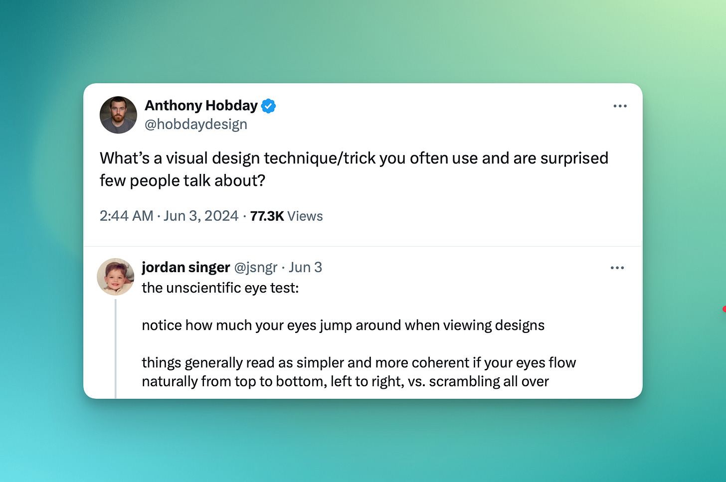
Related: use this tip from Jordan to evaluate your screen, in conjunction with the squint test!
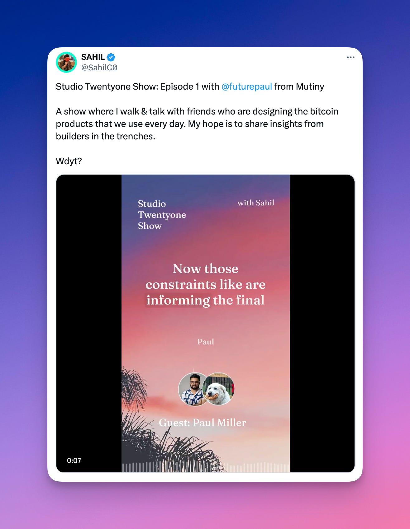
My new podcast: Studio Twentyone Show with Paul Miller from Mutiny
So I’m starting a new experiment: the Studio Twentyone Show, where I walk & talk with the designers actually shipping the bitcoin products we all use every day. No studios, no fluff, all design talk. I’m hoping there’ll be some useful insights for you!
You can watch on YouTube, Apple Podcasts, or subscribe wherever you get your podcasts (click on the Twitter thread below).
✨ Sponsored ✨ Interested in reaching an audience of builders in bitcoin? Reach out
Austin Bitcoin Design Club
ABDC is a monthly gathering of bitcoiners, designers, engineers, and more, from all walks of life. We are building a space for fostering connections, idea development, and most importantly creating a strong sense of a design community from which we may all draw support.
RSVP for the next meetup using the link here: https://www.meetup.com/austin-bitcoin-design-club/
River: Understanding what your users actually need
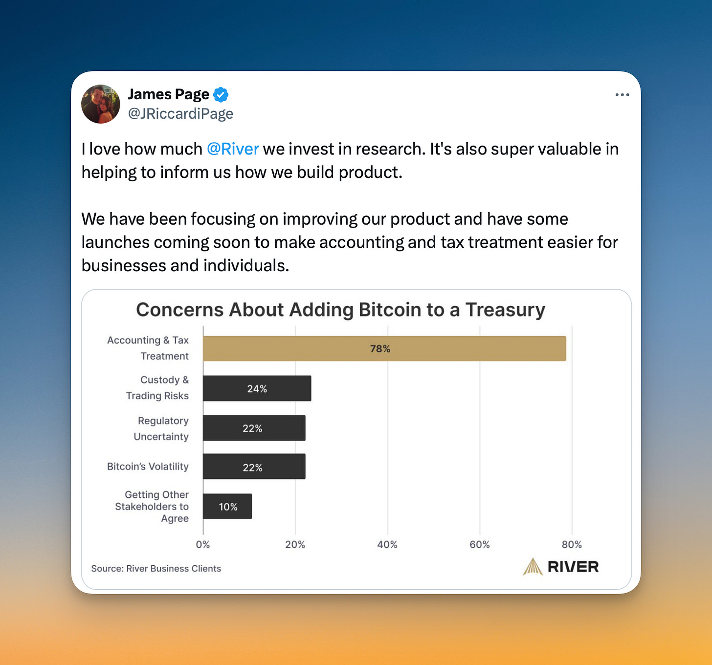
I appreciate the effort River put into learning more about what their business clients actually need instead of speculating (and then losing a bunch of time building it). With this data, clearly the biggest concern is accounting and tax treatment, which they can now tackle head-on.
I think this will also help them differentiate vs other bitcoin financial services companies, which may be starting from different starting points (eg. Unchained starting with collaborative custody).
I’ve always said that all bitcoin companies eventually become bitcoin banks, but you need to find your niche as a starting point (Fold with gift cards, Unchained with collaborative custody, River with exchange/lightning and more). Talking to your customers can help find that edge, after which you can eventually dominate.
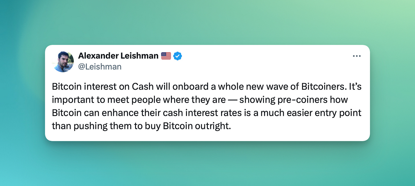
While maybe not directly related, I loved the framing of the new announcement of the Bitcoin Interest on Cash feature. Power users might find this unnecessary (get higher interest in your fav neobank like Wealthfront, then buy bitcoin), but this product skips a step and meets most people where they are. A great point that someone at Austin Bitcoin Design Club also pointed out: this product is a great foot in the door to eventually buying larger sums of bitcoin. Nice!
Bitkey: Meeting customers where they are
Bitkey (from Block) is a collaborative custody bitcoin wallet, leveraging a multikey system with keys on your app, a hardware device, and a server key.
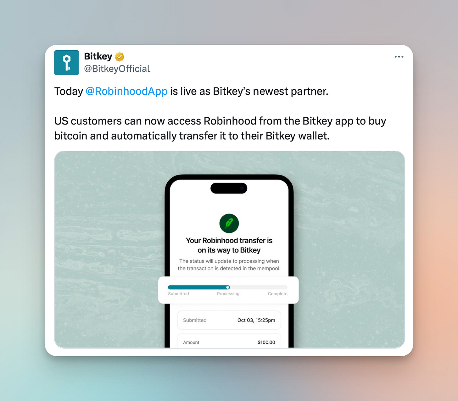
They’ve recently partnered with a bunch of exchanges, including Robinhood, Coinbase, and Cash App, to have a more deeply integrated bitcoin buying experience.
In this screen, you can see an example of the deep integration between their exchange partners and Bitkey. I love how they are meeting most customers where they are at, with this transfer screen. It feels very much like a traditional financial app, using familiar terms like “transfer”, “processing”, and “submitted”, rather than (what some might call more “technically correct”) terms like “confirmations”.
In a similar way, we can explore using more familiar terms like “speed up” or “cancel transition” rather than “use replace-by-fee”.
Different approaches are great, but I’d be willing to bet this more comfortable UI will get more adoption, at least during this transition phase.
What even is design?
I like this articulation of what design is, from Dylan Field (CEO of Figma). Problem solving, with an aesthetic sense.
Why do some layouts feel better than others?
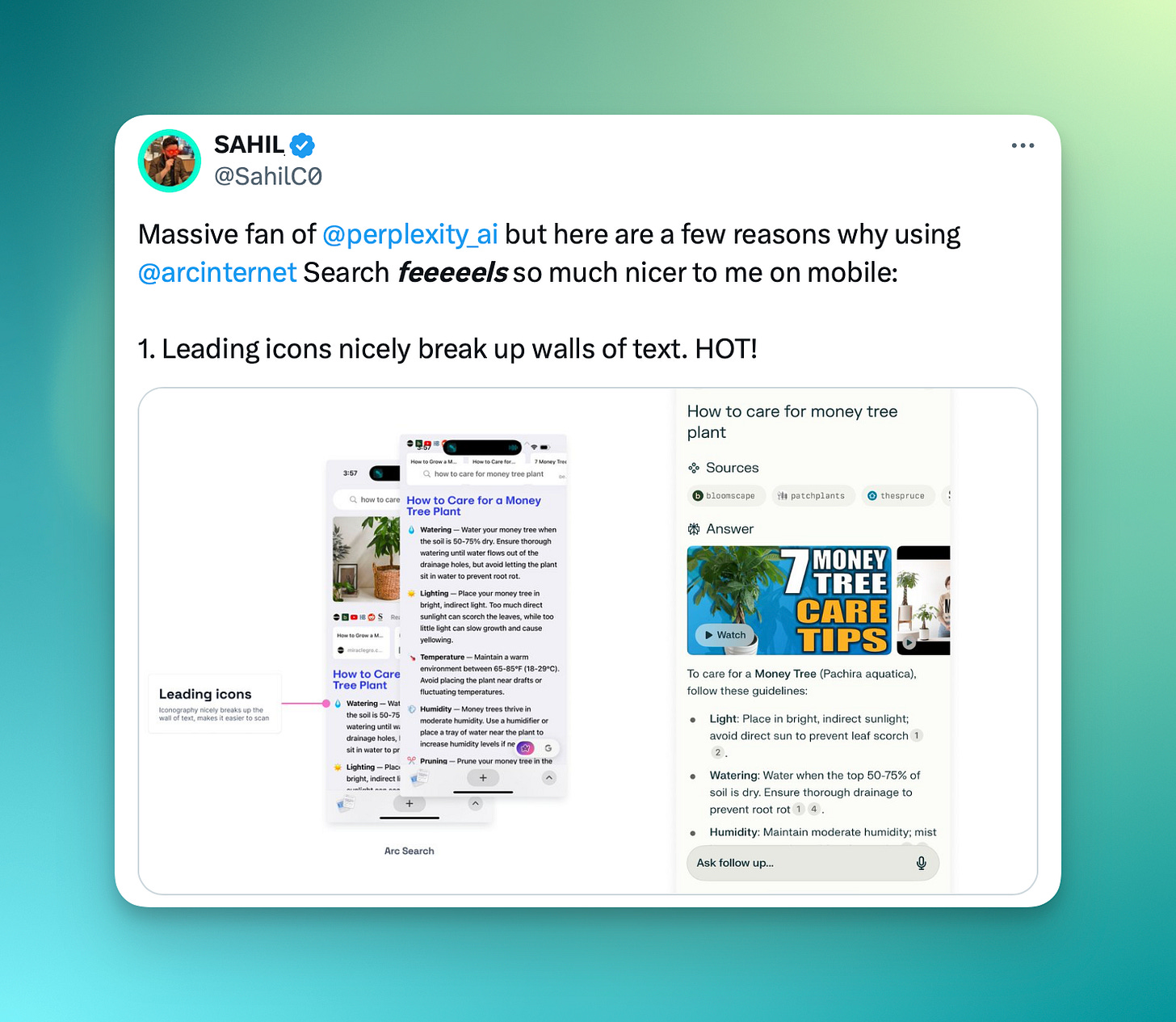
I’ve been using both Perplexity and Arc Search, two AI search engines, for a while. While I’m a big fan of both, I’ve always noticed that using Arc Search always felt much easier to scan and digest information. So I wanted to do a quick analysis of why. Take a look at my Twitter thread below, but I think there are some quick wins Perplexity can pull out to make for a much more pleasurable search experience! What do you think?
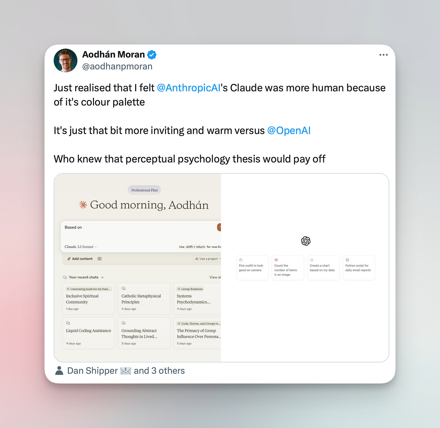
Related: Aodhan identifies the difference in feeling between Claude and ChatGPT. Claude’s type, color palette, and less rigid logo make for a much more humane feel — I agree!
Liquid rebrand
Liquid, a sidechain to bitcoin, recently got a brand refresh. Not a ton to say here, but I do like how they separate out four clear target personas on the site. Take a look!
River: Explain like I’m five
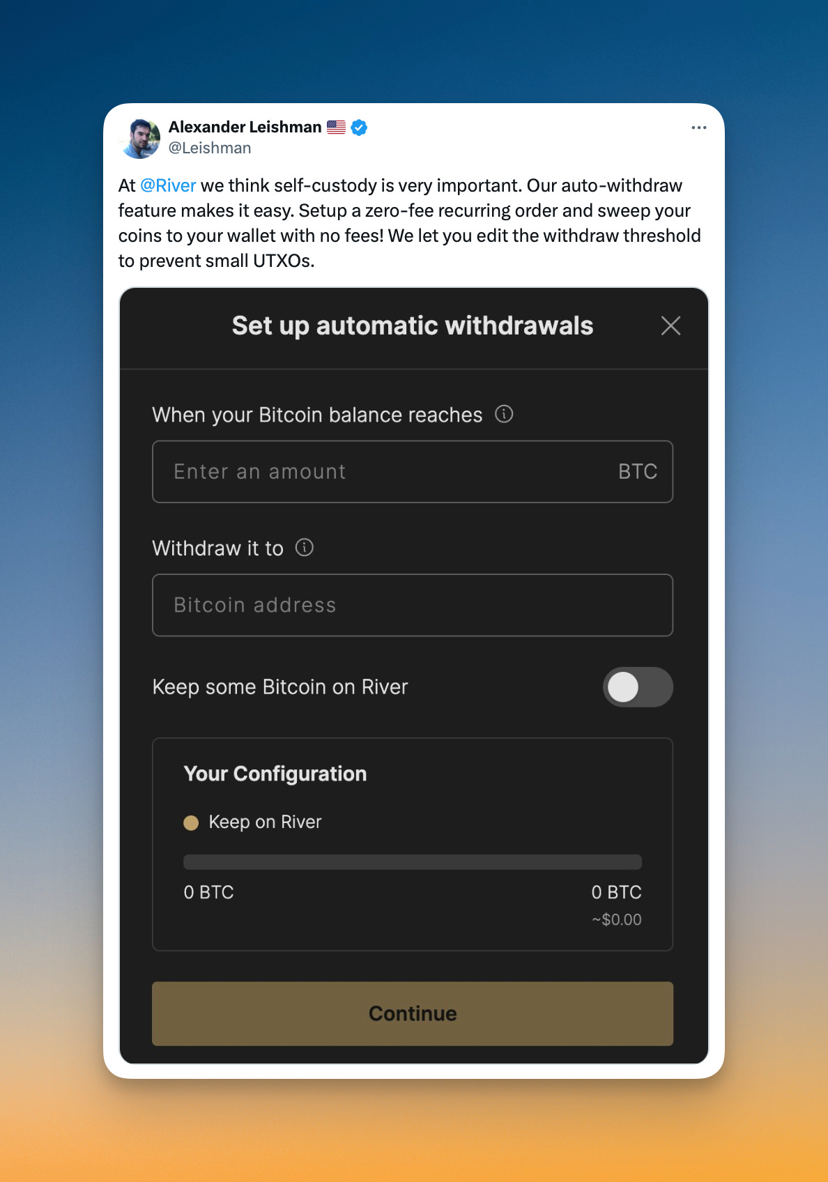
I love how these labels on River’s auto-withdrawal feature are so dead simple to understand. They could have very easily gone with more rigid, wordy, cold language like “Amount of bitcoin to keep in custody” or something. Instead, the label is self explanatory, scannable, and easily understandable: yeah, I DO want to “keep some bitcoin on River”!
Will Cole: talking Product with Jimmy Song
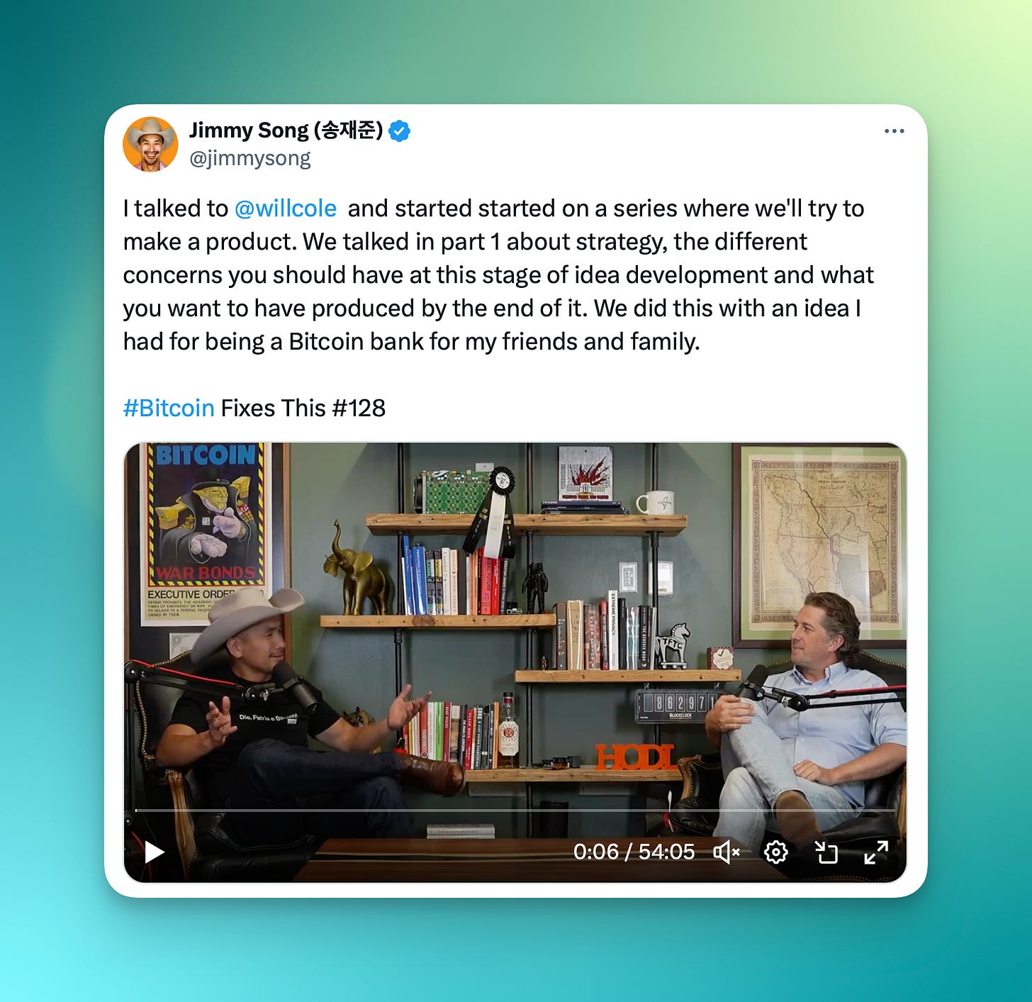
Quick shoutout to friend (and former manager at Unchained!) Will Cole, now at Zaprite, who recently went on Jimmy Song’s podcast to kick off a multi part series on the product development process. Lots of golden nuggets in here, don’t miss it.
See you next month!
Thanks for reading. Let me know what you think on Twitter or Nostr. Feedback is welcome!
Love u,
- SAHIL


