
March 2025: Studio Twentyone Newsletter


While ABDC last month was great as always, the bitcoin design topics were kinda light. No worries; onwards! Short and sweet this time.
- SAHIL

Studio Twentyone Show #5 w/ Mia White: BullBitcoin, Zaprite, PlebLab and more
Last month I published episode 5 with Mia White, a freelance bitcoin designer.
We’re back on the river trail in Austin, where Mia shares her experiences as an independent "cowboy designer" working with various Bitcoin companies like BullBitcoin, Zaprite, Oshi, PlebLab, and many more. Give it a listen!
You can watch on YouTube, Apple Podcasts, or subscribe wherever you get your podcasts (click on the Twitter thread below).

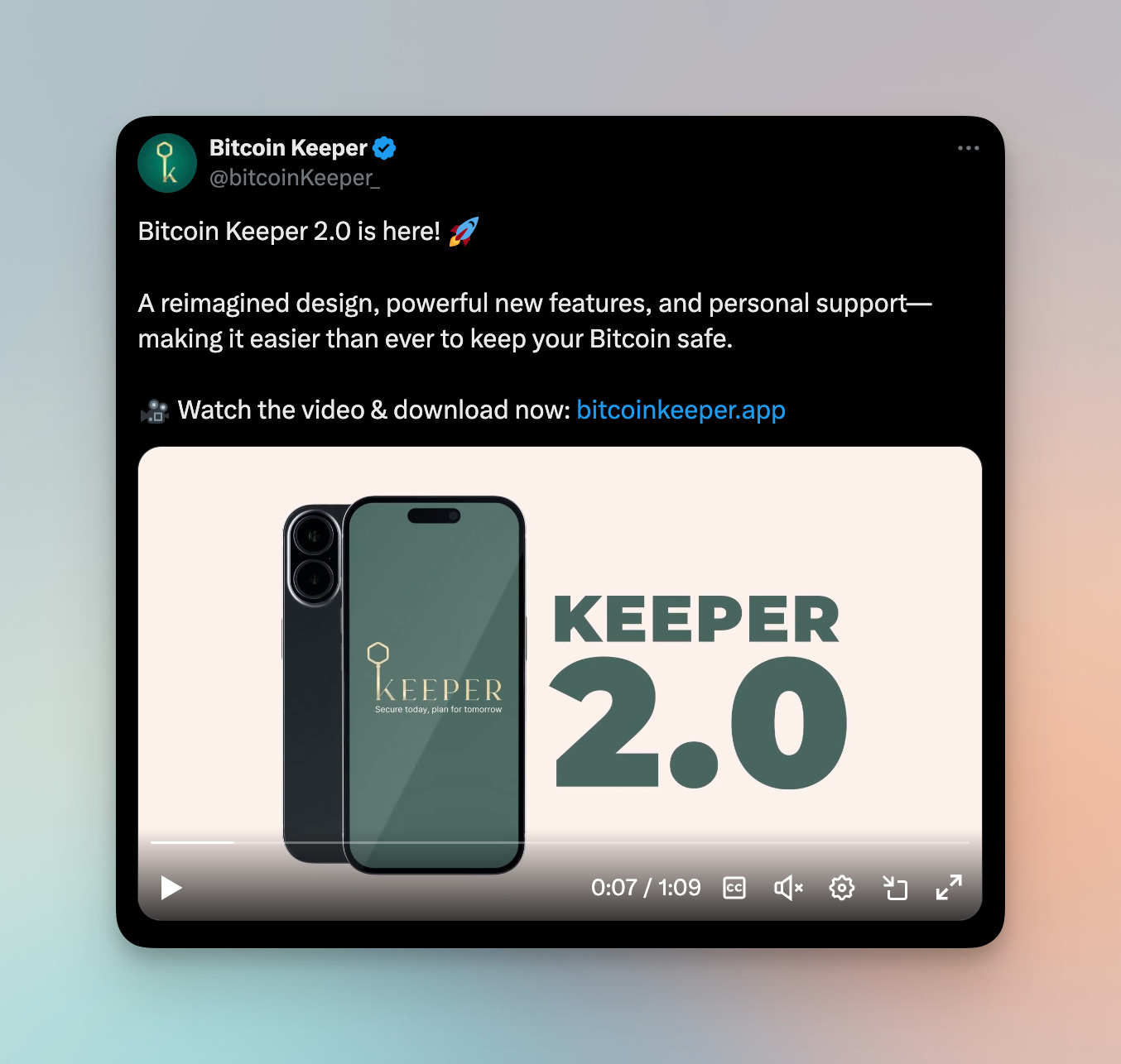
Bitcoin Keeper 2.0: UI upgrades
Keeper gets a refreshed UI and a bunch of new features with 2.0. Lots of great new features like miniscript support, first class concierge ticketed support, and more, but I’m mostly excited about the UI refresh.
They finally switched from the condensed Roboto-like typeface to Inter (creative, I know, but it works!). Claustrophobic vertical cards were replaced with breathable horizontal ones. Advanced modes like miniscript timelocks are hidden under progressive disclosure menus. Great improvement overall!
Disclaimer: I’m an advisor to the company.
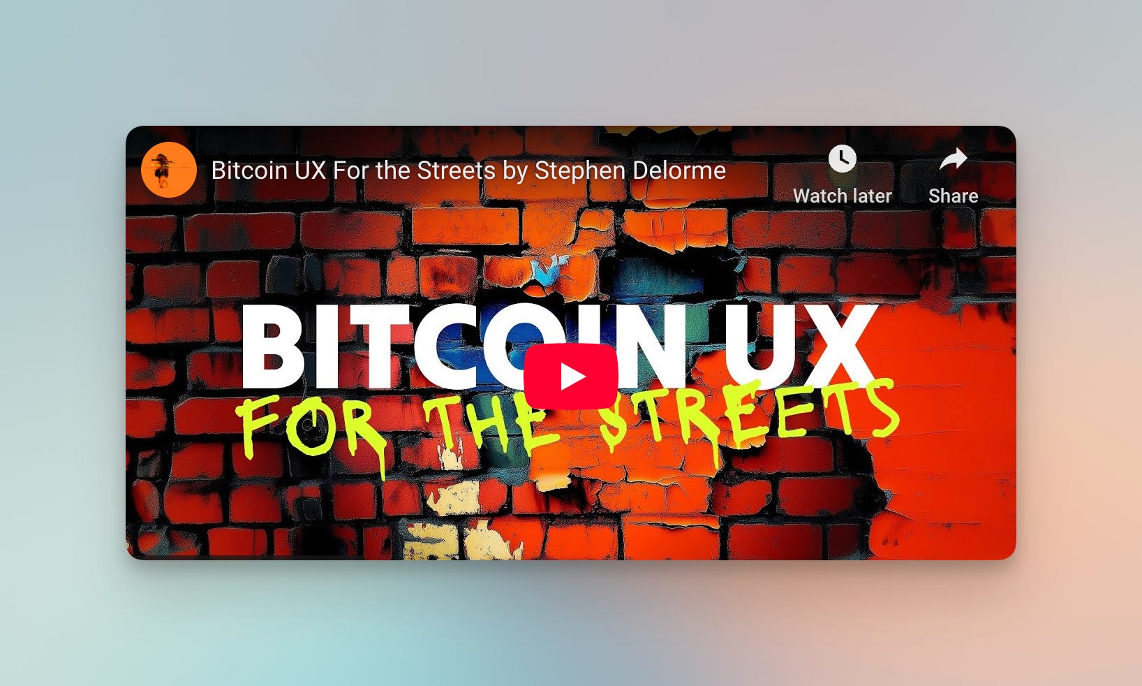
Stephen DeLorme: Bitcoin UX “for the Streets”
Stephen, a friend and UX engineer at Voltage, gives a talk at the Bitcoin Commons called “Bitcoin UX for the Streets”. Through the form of a live user interview, he explores and exemplifies how to improve bitcoin UX. He shares practical strategies to enhance usability and create bitcoin applications that resonate with everyday users. Check it out!
Skyler: “Strategy raised to the power of Bitcoin”
Recently, Microstrategy rebranded the company as “Strategy” to better reflect their corporate strategy of building financial assets leveraging bitcoin. Skyler gives a constructive critique of this rebrand, along with an alternative to tie in some of the legacy brand and add layers of meaning.
Even if it’s a “bridge brand” on the path toward “Strategy Bank”, in general I agree that using the bitcoin B and orange color feels extremely overdone and shows a lack of taste. What do you think?

ForceField: A quick followup
Last month we covered a new branded feature from River called “ForceField” - check out last month’s newsletter to learn more. I just wanted to include this quick post from Alex as a follow up, showcasing the power of building a brand around this feature. They can now successfully say something like “ForceField is protecting $500M worth of bitcoin” instead of “Security features like a time-delayed withdrawals protect customer funds”. Very nice!

✨ Sponsored ✨ Interested in reaching an audience of builders in bitcoin? Reach out
Austin Bitcoin Design Club
ABDC is a monthly gathering of bitcoiners, designers, engineers, and more, from all walks of life. We are building a space for fostering connections, idea development, and most importantly creating a strong sense of a design community from which we may all draw support.
RSVP for the next meetup using the link here: https://www.meetup.com/austin-bitcoin-design-club/

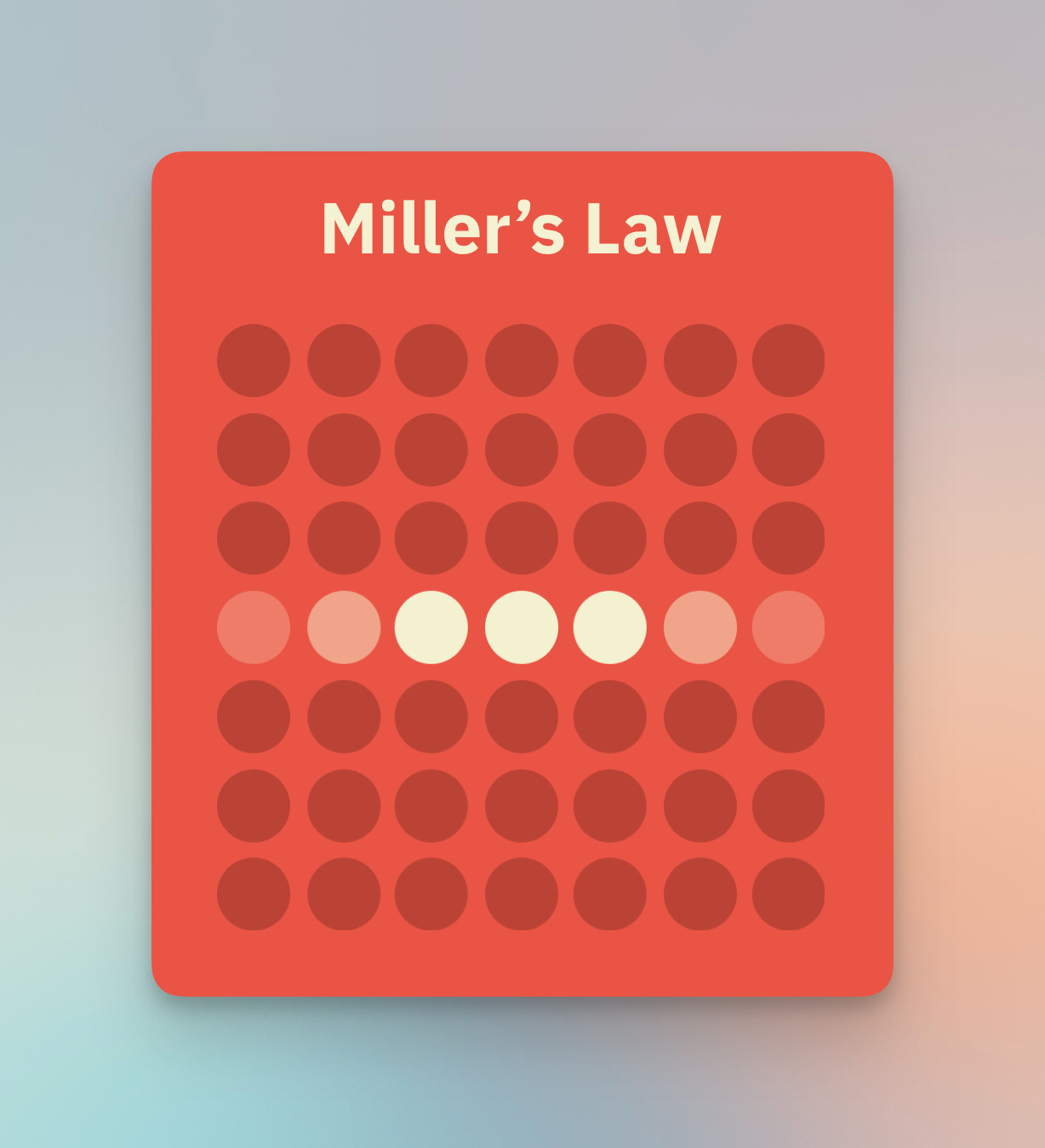
Miller’s Law: Organize info into chunks
Miller’s Law is a design principle that notes the observation that most people can only keep around 7 (+/- 2) items in their working memory. That means, for your UI, you want to organize content into smaller chunks to help your users process and understand easily.
When your user visits your UI for the first time, they are faced with the cognitive burden of not only figuring out how to use your product, but also remember why they came in the first place. This sounds nuts, but remember the context people are finding your product for the first time. They are likely distracted, multitasking, thinking of other important things to do.
If there’s too many choices, too much thought required, or a lack of clarity of what to do, they might just abandon the task altogether thanks to cognitive overload.
Miller’s Law helps as a reminder to remove elements that aren’t helping your user achieve their end goal, and group/chunk elements for greater ease of comprehension. See if this thought can be helpful the next time you’re building an interface!
MDS: a practical interface design upgrade
I often like these exercises on Design Twitter. MDS shares an example of a before/after Card UI, sharing specifics around what makes the interface “better”. Typography, layout, color, and style. I find these to be good teaching/learning opportunities, because sometimes “what makes a design good” can feel subjective or nebulous. Thanks MDS!

AI tools: A change in workflow

AI tools are evolving so rapidly these days that it feels like workflows are constantly changing and upgrading. Here, Fons talks about how his workflow has changed to using Figma just for quickly getting ideas out from his head onto “paper”, and then using a higher fidelity tool to get started building the thing.

Ben South on the other hand, starts with high level prompting to get an MVP out the door with Claude and Cursor, but then gets to the details in Figma.
I think as Figma integrates more AI features like their “First Draft” feature, I could see myself continuing to use Figma as the first point of divergent exploration, before going to Claude or v0 to build the thing.
What do you think? How is your workflow evolving these days?
See you next month!
Thanks for reading. Let me know what you think on Twitter or Nostr. Feedback is welcome!
Love u,
- SAHIL
Great meetup as always, Sahil! Thanks for doing what you do!