July 2024: Bitcoin Design Monthly
Howdy! This is the first monthly Studio Twentyone newsletter. I’m hoping it’ll be a useful look into the bitcoin world from a product and design lens. Enjoy, and let me know what you think 🫡
- SAHIL
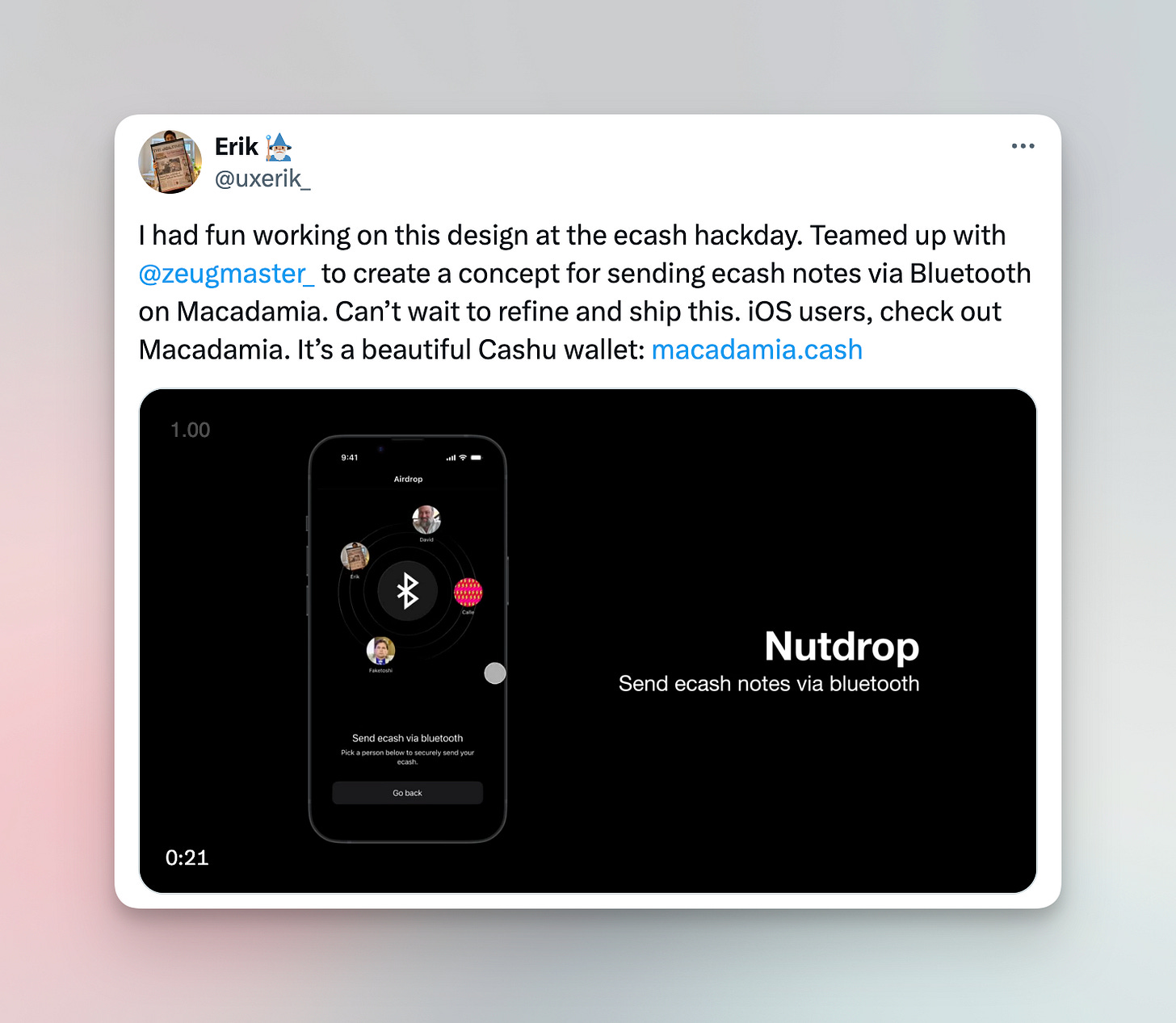
Erik’s ecash wallet UX exploration
Erik is prolific in experimenting with ecash wallet designs. Watch the prototype video in the tweet below: Erik shares an idea of sharing bearer ecash tokens, with an interaction very similar to Airdrop on Apple devices. Cool idea, I’m curious how technically feasible it is. Either way, I appreciate the creativity (and the name!)
Hick’s Law: hold your customer’s hand
I think it could be helpful to revisit a UX principle or two, every once in a while. Hick’s Law says: The time it takes to make a decision increases with the number and complexity of choices.
In layman’s terms (designers love to sound fancy!): help guide your user through the desired task by minimizing their options. If a flow involves multiple steps, break it up to keep them focused on one thing at a time. Progressive disclosure during onboarding can be helpful in reducing cognitive load.
Take a look at the bitcoin wallets on your phone - which ones expose every option under the sun to you, and which ones only have a few branches for steps to take? Which one would you recommend to your mom?
✨ Sponsored ✨ Interested in reaching an audience of builders in bitcoin? Reach out
Austin Bitcoin Design Club
ABDC is a monthly gathering of bitcoiners, designers, engineers, and more, from all walks of life. We are building a space for fostering connections, idea development, and most importantly creating a strong sense of a design community from which we may all draw support.
RSVP for the next meetup using the link here: https://www.meetup.com/austin-bitcoin-design-club/
Passkeys > Passwords
As always, Casa executes on their product experience really well. In this update, they add passkey support. Think of passkeys as a seed phrase that replaces a traditional username/password + 2FA setup. Passkeys can be stored offline, or in a password manager like iCloud or Bitwarden. From an experience POV, passkeys are superior since they obviate the need for a second factor (like an app-based TOTP setup). They also do a great job with visual design execution. Shout out to Casa!
Bitkit rebrand & repositioning
Here’s a refresh of the Bitkit brand. Doesn’t seem like much has changed from a UI perspective, mostly a repositioning of their brand. I’m not sure I totally follow the “Change your wallet, change the world” messaging, but at least it looks dynamic and unique!
I will say, I wish bitcoin brands moved away from the typical bitcoin orange.
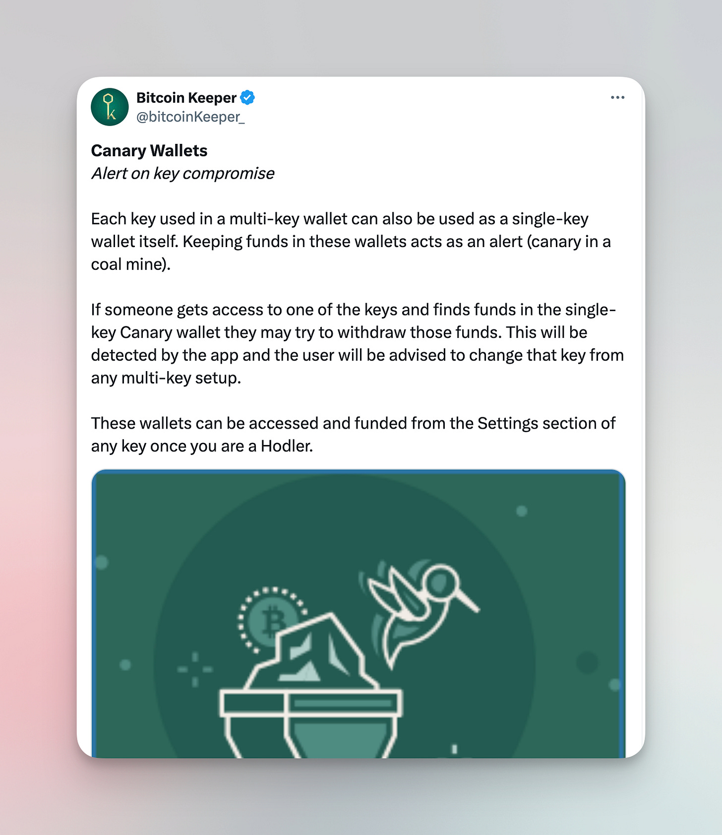
Storytelling of Canary Wallets
If you shipped a feature but no one knows about it, did you even ship it? That’s the power of marketing and storytelling.
Keeper is a multikey savings wallet. Canary Wallets is a feature that lets you drop a little bit of decoy bitcoin in each of the keys of your multikey setup. That way, if an attacker finds one of your keys drain the decoy funds, you’ll be alerted and can take steps to refresh your multikey setup. The canary in the coalmine! Genius positioning.
There’s nothing technically outstanding about this feature, but the branding of it makes it instantly memorable and more likely to be used + shared.
Skyler does a Trezor design audit
Design audits are a useful way of getting a lay of the land of an interface, to see what works and what doesn’t. Skyler points out some great visual design techniques Trezor uses on their marketing website to communicate effectively. Check it out for some simple tips that you can probably steal for your site!
Designing with better visual hierarchy
In this short video, Zander walks through some quick tactical tips on how to make an interface easiest to visually scan and take action on.
He pretty effectively shows the stark contrast before & after working on the visual hierarchy of the interface. Check it out!
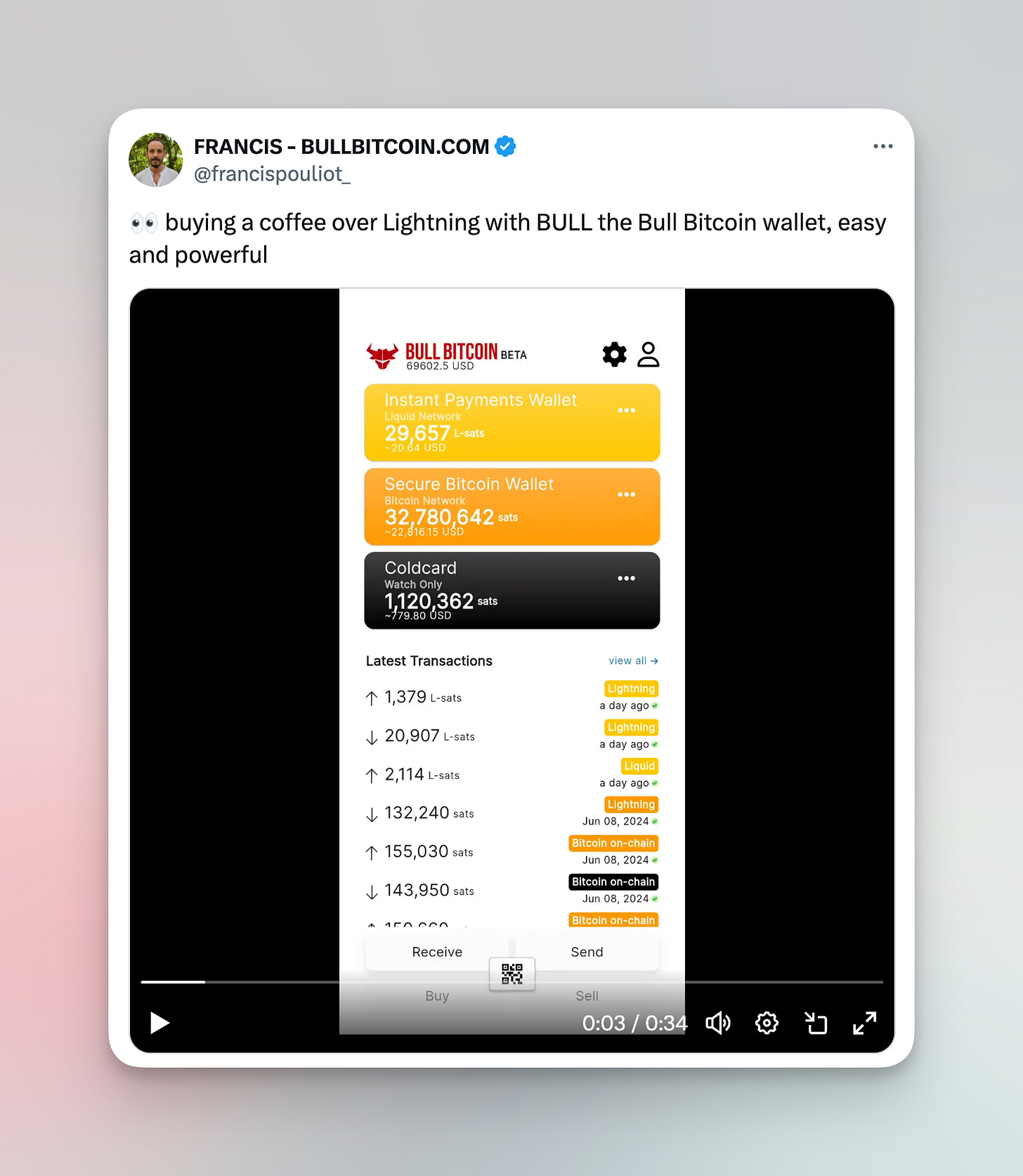
UI critique of Bull Bitcoin wallet
You gotta love Francis and everything he’s done for Bitcoin. That said, there are so many quick visual design wins that can be done to help the new Bull Bitcoin wallet. Tying back to a couple of the other topics, a UI audit would be a great place to start. Zander’s video (the previous topic) on visual hierarchy could provide some useful tips as well. Just a few examples of quick wins:
Line heights: text in the balance cards are bleeding into each other
Spacing: card padding are inconsistent
Fonts: You only really need a handful of weights and sizes, here we have like 17.
Better visual hierarchy for primary actions (send/receive)
Alignment: icons and alignment with their rows
This is not meant to pick on Bull Bitcoin by any means (really - love you Francis!) - just highlighting that some quick wins can really help level up the polish of any bitcoin app. People notice the feeling of a polished app, whether they can describe it or not.
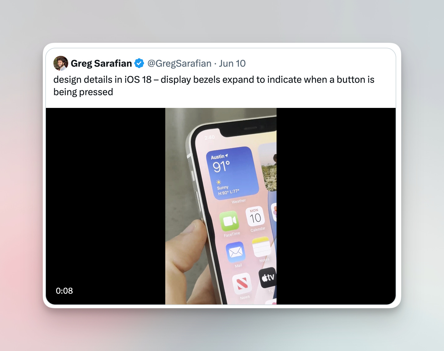
Apple iOS 18 design polish 🤌
Here’s some eye candy from Apple’s recent launch of iOS 18. One of the most important skills of being a designer is leveraging your taste, and the good news is that can be learned! Looking at “well designed” products and understanding why they are “good” is a great way to leveling up your taste.
See you next month!
Thanks for reading. Let me know what you think on Twitter or Nostr. Feedback is welcome!
Love u,
- SAHIL








Thanks for the shoutout!
Re: Bitkit messaging:
The tagline ‘Change your wallet, Change the world’ targets the ‘Bitcoin hero’—those who value autonomy, seek to become true network participants, and spend their ₿ on goods and services.
By being responsible Bitcoiners (managing keys, running nodes, not only hodling, but spending Bitcoin), users help strengthen Bitcoin's resilience and promote a circular, permissionless, and borderless economy, built on Bitcoin.
The tagline is part of this broader narrative and aligns with our other messages, like ‘₿ The Change’ and ‘Financial freedom in your pocket’.
For a deep dive into our messaging and positioning, read the copy on bitkit.to and check the Bitkit onboarding in the app. And yes, our orange (#ff4400) is unique 😎🙌.
Great initiative 👍👌🙌