


February 2025: Studio Twentyone Newsletter

Skipped January ‘cause of the holidays. Hope you had a great one!
- SAHIL
Studio Twentyone Show #3 with Sasha of Unchained
In December I published episode 3 with Sasha Klein, a frontend engineer at Unchained.
Sasha shares his journey from English major to bitcoin engineer and his unique perspectives on building user-friendly self-custody solutions.
He really is one of my favorite people to talk to. Hope you enjoy!
You can watch on YouTube, Apple Podcasts, or subscribe wherever you get your podcasts (click on the Twitter thread below).

A lesson in product marketing from River
I got an email the other day from River about a new feature called ForceField. While it’s a useful security feature, what was more interesting to me was the branding and positioning. Basically, it’s an offchain timelock of sorts where you can limit or turn off bitcoin sends (under a weekly limit) with a delay, to protect yourself from attackers.

I made a short video talking & walking through what I loved about it - give it a watch! They could have very easily made it a couple toggles in settings: “Turn on time-delay”, “Limit withdrawals”, or something of the sort. But giving the feature a branded name helps it make a splash and makes it feel like a cohesive feature.
After all, if you ship something but your customers don’t know about it, did you really ship?

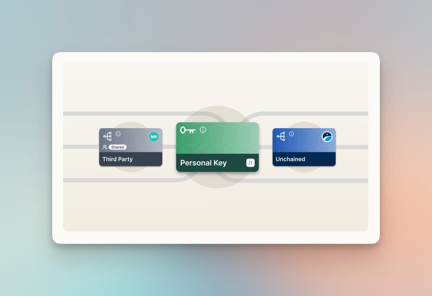
Updated visual language for Keys with Unchained
Maggie, a designer at Unchained, recently wrote a case study of their process of redesigning how keys are visually represented on the Unchained platform. You can see in the before & after how well all aspects were considered. I remember firsthand working at Unchained how challenging communicating some of this information is. What I love the most is how scalable the system is: from small icons to full-sized cards. And the little bit of texture on the background of the keys with the Unchained-branded ornamentation is a great touch (zoom in!). Well done Maggie!
Studio Twentyone Show #4 with Lee of Fold
In January I published episode 4 with Lee Gordon, a product design lead at Fold.
Lee shares his bitcoin design journey, and insights from his role in Fold’s evolving product and brand direction. We discuss design systems, creative freedom, and more.
You can watch on YouTube, Apple Podcasts, or subscribe wherever you get your podcasts (click on the Twitter thread below).

Getting to the point with Mempool.space
Looks like Mempool.space redesigned their mobile view, giving a super clear, to-the-point look at the status of your transaction. Advanced viewers can still tap “See more details” to see more, but I’d be willing to bet the vast majority of mobile users just want to see the status of their transaction at a high level. Thoughtful touch by the Mempool team!

Rjindael thinks it looks like Domino’s Pizza Tracker 😅

One bit of unrelated feedback to the Mempool team: there’s not a lot of visual hierarchy on the page. It often takes a lot of eye scanning to find what I need to find - everything calls my attention. What do you think?
✨ Sponsored ✨ Interested in reaching an audience of builders in bitcoin? Reach out
Austin Bitcoin Design Club
ABDC is a monthly gathering of bitcoiners, designers, engineers, and more, from all walks of life. We are building a space for fostering connections, idea development, and most importantly creating a strong sense of a design community from which we may all draw support.
RSVP for the next meetup using the link here: https://www.meetup.com/austin-bitcoin-design-club/

Christmas gifting delight with River
This was in December, but I loved this little bit of delight users can add when creating a River Link as a way to gift bitcoin to friends and family. Picking a little gift animation makes it feel a lot more fun!

UX 101: Mental models
A mental model is what your user believes about how your feature, product, or app works. They are built up over time while using other products, and help them intuit how to use new systems that they come across. Kind of like a shortcut.
This piece from NN/g talks in depth about what mental models are, and how a primary goal of designers is to both communicate the intent of your interface (to accurately shape the users mental model) but also respect the existing mental model (aka, the past experience of your users).
Mental model inertia is really strong. If your customers are used to most sites and apps behaving one way, you’d better have a really good reason to deviate from that, unless you want to cause unnecessary friction.

Are we done with design tools?
AI tools like Claude, Cursor, and v0 are making it shockingly easy for builders to rapidly prototype ideas. Paul here suggests that many are replacing Figma as a tool with directly jumping into code.
I think this works fine for builders who are extremely comfortable working in code, or for more complex prototyping situations (eg. tables. Tables suck in Figma).
But I agree more with Bryan here, that the point of lower fidelity tools like Figma are not necessarily for building the “final” polished design (although they can be!), rather for quickly exploring many divergent directions and ideas before starting to converge.
If working directly in code works faster for you, then do that! For many, a tool like Figma allows us to rapidly try and test new ideas.

See you next month!
Thanks for reading. Let me know what you think on Twitter or Nostr. Feedback is welcome!
Love u,
- SAHIL