
August 2024: Bitcoin Design Monthly


What a crazy month. Thanks to the Bitcoin 2024 Conference in Nashville, there were many more product announcements and things to talk about than I’m gonna be able to cover this month. Hoping they can spill over into next time!
- SAHIL
Meme of the month
Enough said.
Family Wallet: A masterclass in polish
Family is an Ethereum wallet. While I don’t recommend buying shitcoins, there is no denying the Family team has crushed it with polish and attention to detail. This is a monster of a post by Benji, documenting many of the world-class interaction details in this app.
There’s so much bitcoin products should be stealing from this post. Benji talks about simplicity and progressive disclosure using their dynamic tray system, continuity using motion design, fluidity, and so much more. It really is a must-read and a must-save for later, as a reference.
“Truly great design transcends aesthetics — it creates a deeper bond between individuals and technology. Our lives are full of digital interactions and infusing these moments with some degree of magic feels essential “
Jakob’s Law: Don’t (always) reinvent the wheel
As we revisit basic UX principles, Jakob’s law talks about how users prefer your product to work similarly to others they have used. It’s almost like a shortcut in onboarding to your product: they’ve already learned how to use it.
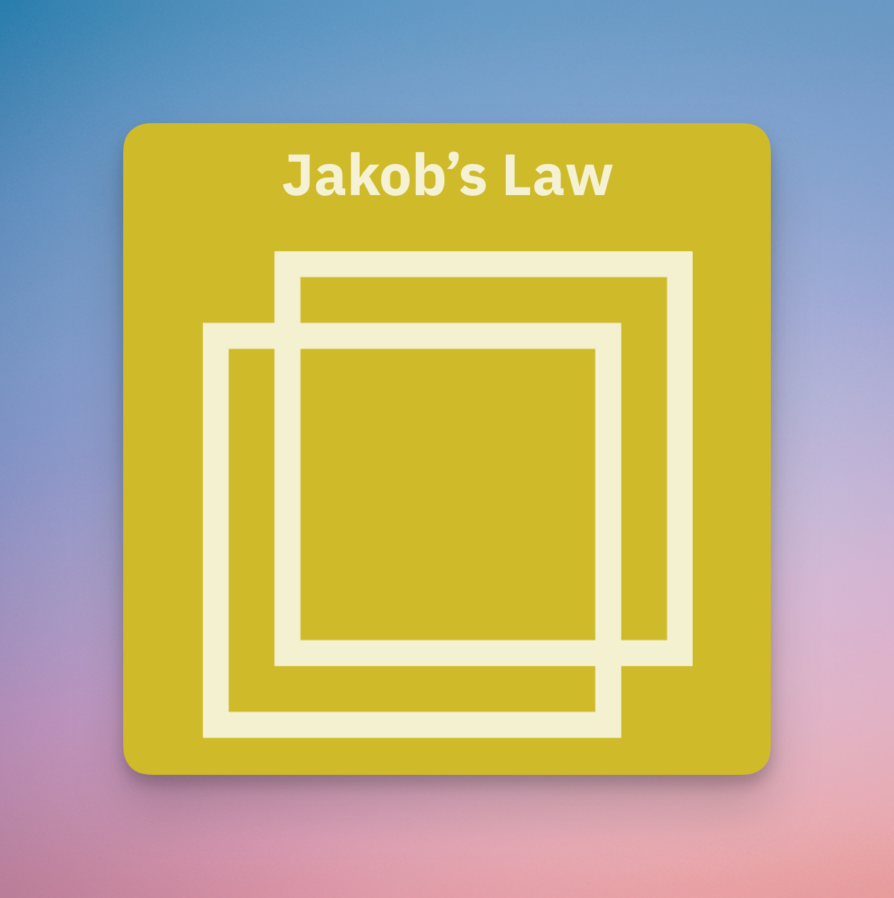
A fair question would be: when do you break this rule? Do all products need to feel and work the same way? This piece talks about Jakob’s Law and when to break it. An example is Arc Browser, which broke common design patterns around web browsers, as a differentiating factor, going up against large incumbent competitors.
I think bitcoin has enough experience challenges as it is. Applying Jakob’s Law to bitcoin products means meeting users where they are: let’s build familiar experiences that highlight bitcoin’s strengths while hand-holding users through challenges.
✨ Sponsored ✨ Interested in reaching an audience of builders in bitcoin? Reach out
Austin Bitcoin Design Club
ABDC is a monthly gathering of bitcoiners, designers, engineers, and more, from all walks of life. We are building a space for fostering connections, idea development, and most importantly creating a strong sense of a design community from which we may all draw support.
RSVP for the next meetup using the link here: https://www.meetup.com/austin-bitcoin-design-club/

River: New chart animation
Alex and the River.com team do a fantastic job with their product’s user experience. I’m a very happy customer. I also love how much Alex shares on Twitter about new product experience updates, highlighting new delightful details.

In this case, I have a couple constructive thoughts:
Related to the last post from Family about motion design: the animation feels jarring to me. The numbers scroll with an ease-in, but then stop all of a sudden without any sense of fluidity. Also, as one reply in the Twitter thread points out, some numbers scroll up while others scroll down, leading to a disjointed feeling (to me, at least).
The changing green/red colors seem distracting to me.
Overall, it feels like a design decision better fit for a trading app than a savings app.
On the other hand, 99% of my River app usage is checking the price!
What do you think?
80/20 principle of design
Often, in this newsletter as well as Austin Bitcoin Design Club, we talk about complex design principles and intricate details using motion and other techniques. That said, a lot of you reading are PMs, engineers, or solo founders looking to ship product quickly and iterate.
I like Ashish’s tweet here as a reminder that a big part of a functional, visually appealing design is simply getting the right type structure and spacing. We’ve covered these “80/20” techniques (20% of work that gets you 80% of the outcome) in the past, and will definitely cover more in the future.

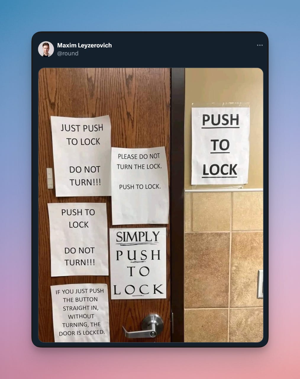
Bluewallet’s scary warning banner
Bluewallet is a pioneer in bitcoin wallet UX. It was one of the first bitcoin products I used that felt like it was approachable to the average Joe.
Here, a BW user finds a scary warning banner on their “watch-only” (read: deposit-only) wallet. To me, the warning seems a little heavy-handed. I wonder if another solution could be a lighter warning banner, in-context of the action: specifically at the time of deposit. Doing so on the wallet homepage seems premature.

A better approach to this warning could be similar to how Unchained Mobile handles utxo warnings, in context, on the deposit screen. Note the yellow warning banner. A step further could be a more neutral (but still attention grabbing) primary color, like the Unchained/Bluewallet blue color.

Redesign & repositioning of Fold
I’ve been a Fold user for years. This update led by Rachel Mersky and Lee Gordon successfully cements a new direction for Fold. The visual design is updated with a much more premium, polished feel, with subtle moving gradient-balls of yellow, orange, and blue behind the cards on the surface. Type hierarchy is better, and primary actions to take are much clearer.

Critically, the repositioning of Fold as “gift card + debit card + rewards” to “all in one bitcoin bank” is a much needed move, in my opinion. Pulling out the account and routing number to the home page really helps with that (you’d be surprised how many people didn’t know about this feature before!).

I use Fold as my full-time bank, and you can read more about my journey using Fold here.
How to spot janky UI
A short but sweet tip from Brian. Give it a try as part of your product development and QA process!

Periodic table of branding
I liked this visualization from a talk at Config 2024. It’s like a visual checklist of touchpoints if you’re building or redesigning a brand. Give it a watch!

See you next month!
Thanks for reading. Let me know what you think on Twitter or Nostr. Feedback is welcome!
Love u,
- SAHIL